I’ve been furthering my investigations into whether an event horizon collapses on you as you approach it. One of the main sticking points now seems to be the concept of the light cone. In short, the light cone shows you in which way space and time warp as your inertial frame changes in a relativistic fashion (significantly large relative to light speed).
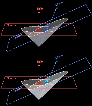
This is about as accurate a picture as I could find:
Obeying the absolute nature of light speed, or c, the diagonals always stay at 45 degrees. It’s space (x axis) and time (y axis) which shift on us. Things moving away are stretched out, things approaching us are smushed in. Both time-wise and space-wise.
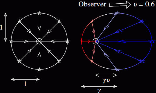
Here’s a nice top view of the above light cone.
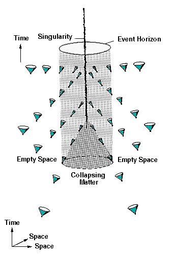
Now I don’t know why, but for some reason, established journals are throwing this light cone out the window when using them to illustrate the approach of a black hole. Here’s one:
Keep in mind this is the same light cone as what we rigorously explained above. Not sure what’s so special about the area outside a black hole that it would rewrite the very nature of how those light cone diagonals would point? Call it hubris but it seems quite sloppy to me.
Of course, the very idea of those light cones inside the black hole, with both diagonals pointing inward, is like having an axis with two negative sides.
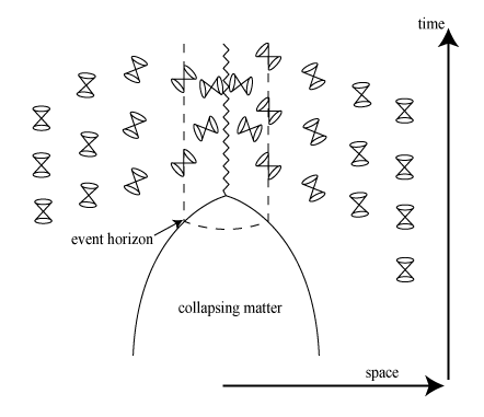
Here’s another one:
I could show more but they’re equally eyebrow raising. Again, I’m fully committed to admitting I’m wrong. But if I am, we have some simpler issues to straighten out first.
More later.


